Unsolicited Concepts Vol. 01: A Love Letter to Chili Crisp
Sometimes you need to find joy in what you do again.
Lately, I’ve been thinking a lot about what got me into design in the first place. What was the dream? For me — and honestly, probably for a lot of designers — it was packaging design. There’s just something magical about walking through a store, grabbing a product off the shelf, and being able to say, “Wait… I designed that.” It’s design people actually live with, interact with, and consume every day.
Over the years, I’ve had the chance to work on packaging projects here and there, but most of my career has lived in the world of digital brands, corporate marketing, and agency work. So I decided it was time to create something just for fun again. Something with no client revisions, no endless feedback loops, and no “can we make the logo bigger?” emails.
That’s where Unsolicited Concepts came from — a series of self-initiated passion projects where I can explore branding and packaging purely for the love of it and reconnect with the part of design that originally inspired me.
And lately, my newest hyper-fixation has been Lee Kum Kee Chiu Chow Style Chili Crisp Oil. I’ve been putting it on basically everything, so naturally it became the very first concept in the series.
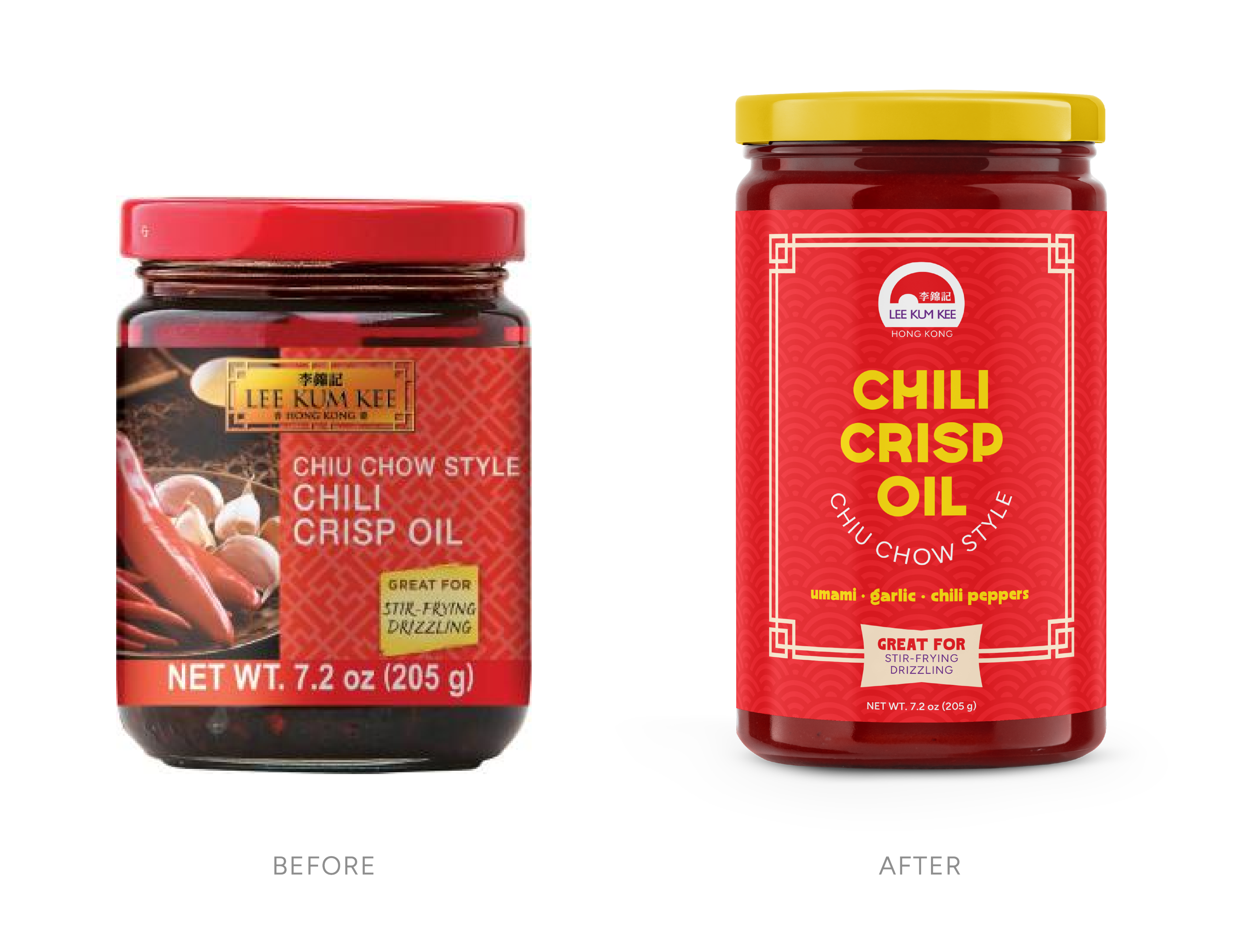
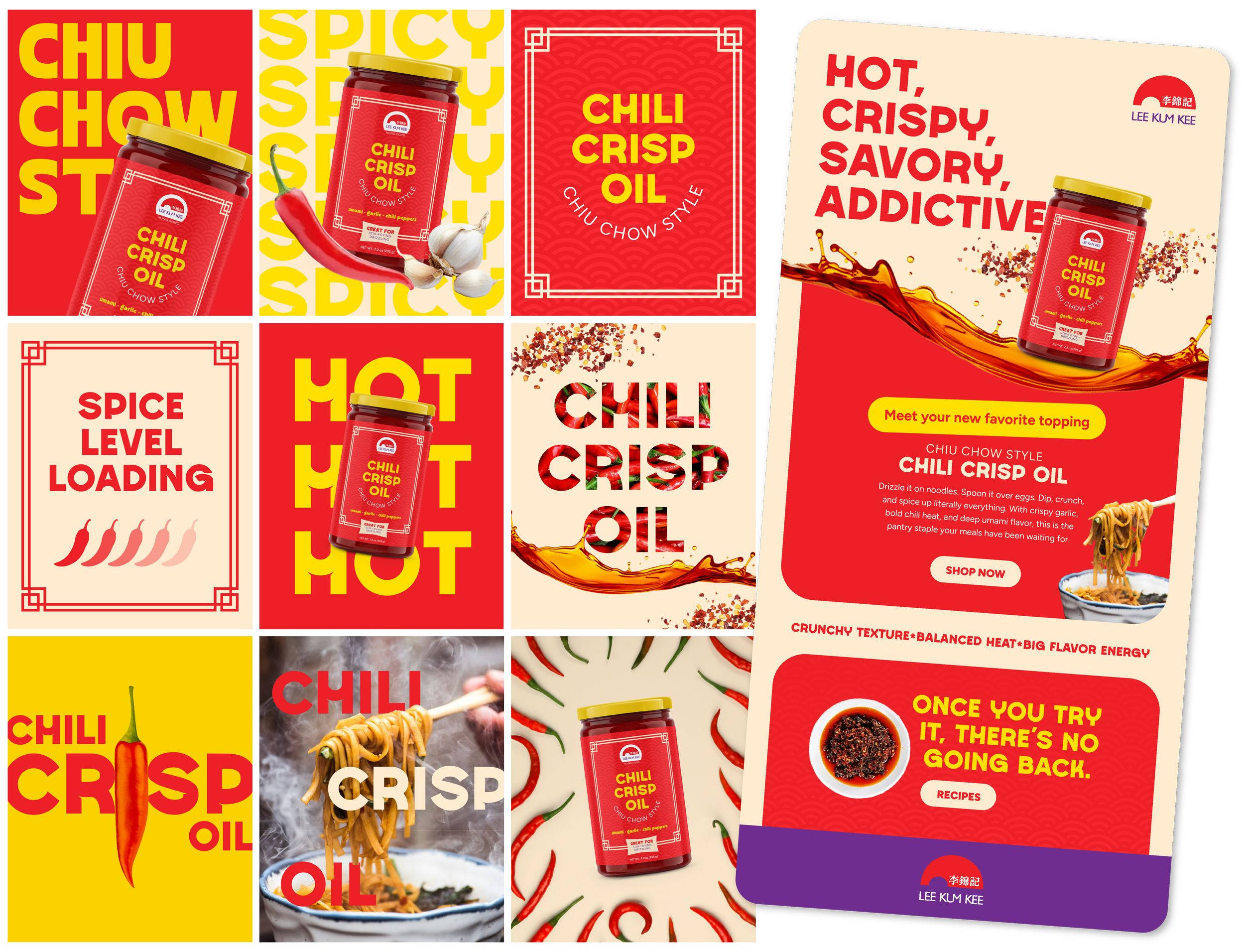
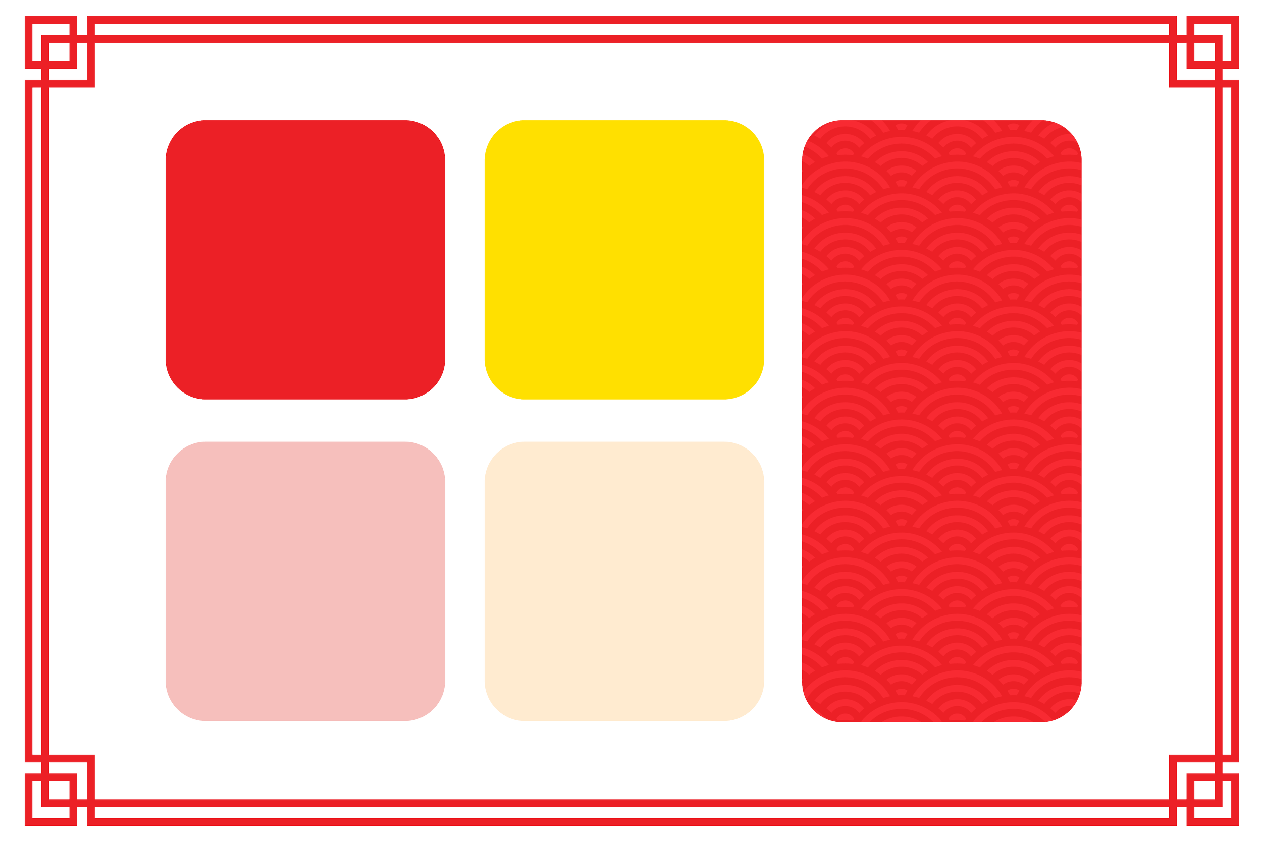
My goal with this project wasn’t to completely reinvent the brand, but to reimagine it through my own creative lens while still respecting the roots of what makes it recognizable. I kept the iconic red and yellow palette because, honestly, those colors are chili oil. They immediately communicate heat, bold flavor, and that punchy shelf presence the category is known for.
I also incorporated Asian-inspired patterns and graphic elements to stay connected to the heritage of the brand. I’m by no means an expert on the culture, but it felt important to preserve some of that visual foundation rather than stripping it away completely for the sake of making something “modern.” The goal was to evolve, not erase.
One of the biggest additions to the palette was the soft cream tone used throughout the system. Since Chiu Chow Style chili oil has roots in Chiu Chow, China, and became widely popularized in Hong Kong, I spent some time diving into Hong Kong-inspired graphic design and vintage packaging references. A lot of those visuals balance bold saturated colors with softer neutrals, creating something energetic but still refined. The cream helped balance the intensity of the reds and yellows while giving the brand a slightly more elevated, contemporary feel.
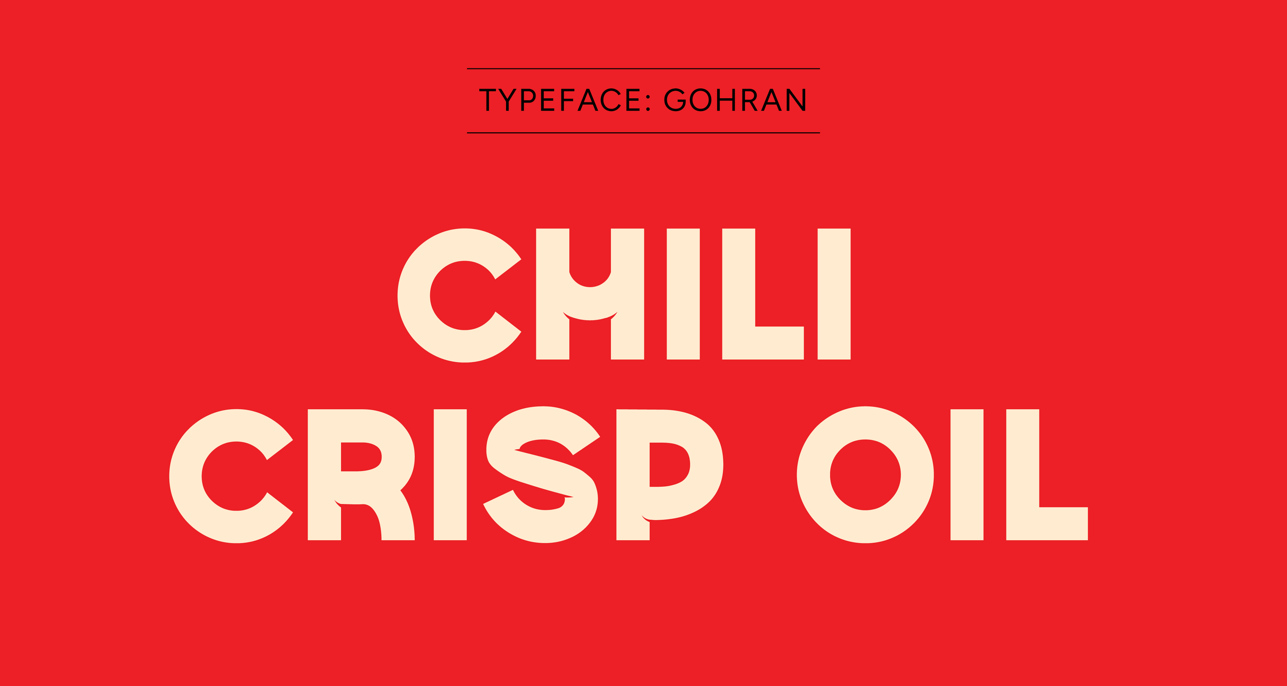
Typography played a huge role in the redesign too. Flavor-wise, this chili oil is already a 10/10 for me — but from a shelf appeal perspective, I felt there was room to create something more eye-catching and competitive within today’s chili crisp market.
For the primary typeface, I chose Gohan because it feels playful, modern, and full of personality while still pairing naturally with the existing Lee Kum Kee logo. The curved forms and arch-like details subtly echo the logo shape of the parent brand, helping everything feel connected rather than disconnected.
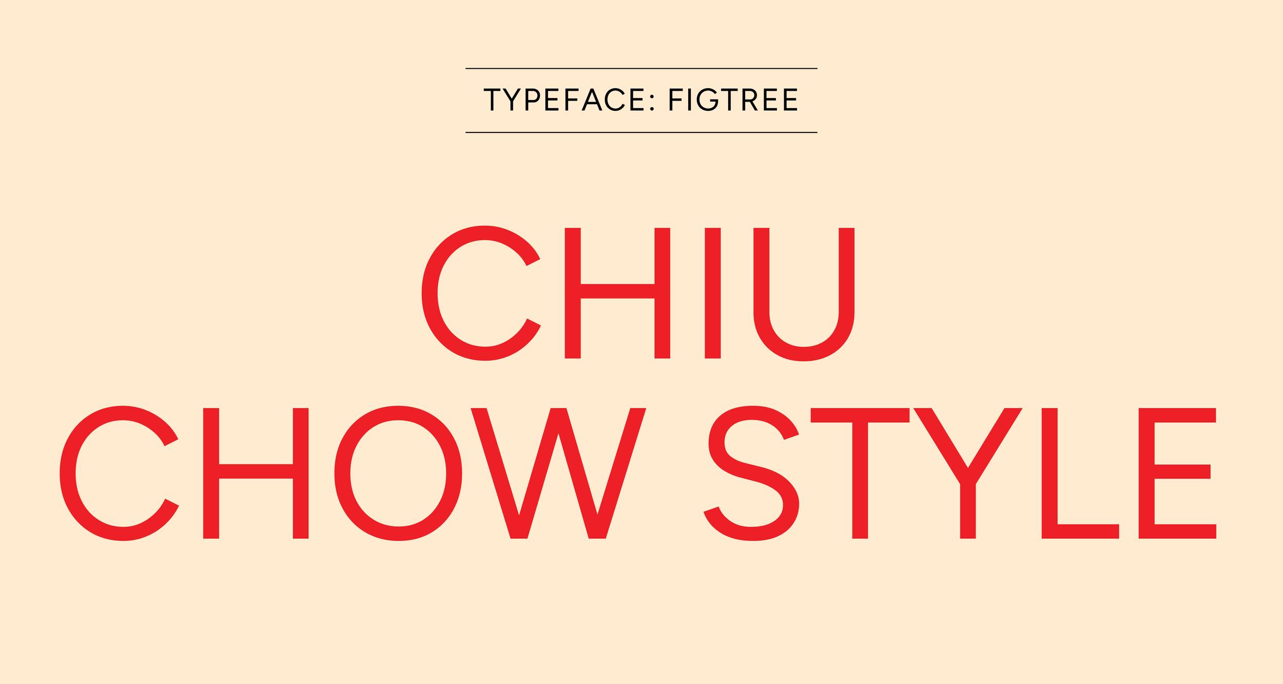
For the secondary typeface, I used Figtree — a clean but friendly geometric sans serif that performs incredibly well at tiny sizes, which is essential for packaging. It keeps things readable without losing warmth, which was important for a product that already has such a strong personality visually.
At the end of the day, this project wasn’t about redesigning a product because it “needed fixing.” It was about taking a brand I genuinely love and exploring what a refreshed packaging system and campaign world could look like. More than anything, it was a reminder to myself that design can still be fun. Sometimes you just need to create something because you’re excited about it again.
Disclaimer: Unsolicited Concepts is a personal creative series created for portfolio and practice purposes only. All concepts are unofficial and are not affiliated with, commissioned by, or endorsed by the original brands or companies shown. All trademarks, logos, and product names remain the property of their respective owners. These projects are simply creative explorations created out of admiration for the brands and products that inspire me.